
A bit late on this post, but hey! Better late than never.
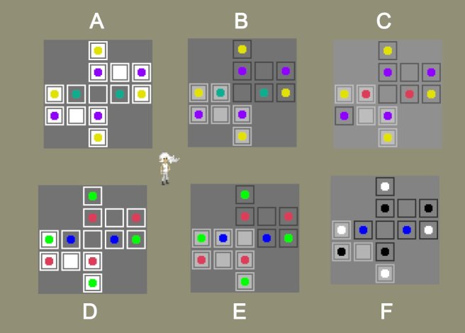
This weekend, I streamed some work on improving the starting area. Managed to get in a few non-trivial puzzles to cap off the area a bit better and introduce the concept of locked tiles. Locked tiles are just tiles that you cannot toggle from their starting state. Here’s a screenshot of those new puzzles ( a bit low quality cause I snapped it from the stream video):

I also changed the game from an oblique renderer back to an orthographic one. This is a bit of a subtle technical detail, but suffice to say that the change simplifies some graphical things and makes some others more complex.
I had hoped to do the first full art pass on one of the game’s areas, but unfortunately I ran into a bug with Unity’s tile-mapping system. I upgraded to 2018.1 in an attempt to fix it, but I have since been told by Unity Support that the bug is not fixed until 2018.2b, so I will either have to upgrade to the latest beta version, or wait until it gets a full release to hopefully get started on that.
Colorblind Safety
In last week’s devlog post, I talked a bit about some of my thoughts relating to accessibility, particularly when it comes to deaf players. This week I’ve been thinking more about colorblindness.
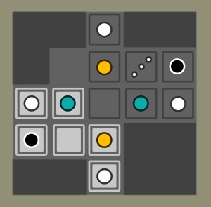
Trying to come up with a set of color-blind friendly color options is quite difficult as there are several different forms of the condition. Some people have a hard time telling between red and green, and others between blue and green, and a rare few cannot distinguish colors at all.
I tried a few different variants, but many of them had problems:
The absolute best way to deal with colorblindness, of course, is to just use different symbols instead of different colors. This unfortunately is not a straightforward option for Taiji, as differently shaped symbols have different mechanical meanings. You can also use patterns instead of colors, but since the game uses pixel art, the detail possibilities are very limited.
Luckily, since most people can tell the difference between blue and yellow, those colors in combination with black and white provide a 4 color setup that will work for most people and most puzzles, at least where the only thing that matters is telling the colors apart.
However, this may still not be enough for some players, so I’ve decided to address this issue with a two pronged approach. For most puzzles in the game, I will just stick to the “safe” color palette, and the game should be accessible to many players by default. However I will have an additional assistance menu where the player can choose alternate colors if the defaults are not easily distinguished.
Additionally, there will be a set of completely color-free assistance symbols which can be enabled. These will be useful for puzzles where the player needs to know exactly which color they are looking at, or for when more than 4 colors are necessary.
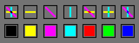
Here’s my first pass at that:

Of course, the symbols themselves are subject to change, but the important thing is that the symbols combine and mix the same way that colored light does in the real world. In this case, the color model is subtractive.
For clarification on what I mean, here are the symbols again, now colored with their corresponding colors:
I’m not certain this will work for all the puzzles in the game, but it’s a start and it’s fun to think about.

Have you had a look at how Overwatch handles colour blind options? I don’t know too much about the subject myself, but if I remember correctly it has three or four options, each one corresponding to a different specific kind of colour-blindness. Might be worth looking at
LikeLike
Yeah, I may do something like that, although I’ve heard that it’s usually better if you don’t try to pick colors that will work well “in theory”, and instead just give players as many options as possible. It should be fairly easy to do, as most of the puzzles in the game will have at most 2 colors in addition to black and white.
There will definitely be some concerns when it comes to an actual color-focused area, although that is yet to be designed, so we’ll have to see how it turns out.
LikeLike