Although I had put together a prioritized to-do list, with implementing the new control method at the top. I decided to do something else this week and redesign the “dice face” puzzle area. (I also need to start coming up with some themes and ideas for these areas so I have better names for them)
Although maybe not the biggest priority on the list, it was an important thing to do. Even though the dice face area was not the weakest part of the game, it was definitely the most bloated.
When I’m building out a new area or set of puzzles, usually I just start by adding as many puzzles as I possibly can. This is good because it ensures that I have a good pool of puzzles to draw from and have hopefully made some strides towards exploring the possibility space of the mechanics. It’s not possible to be 100% sure that I haven’t missed some good ones, but overall I end up with more than enough puzzles to work with.
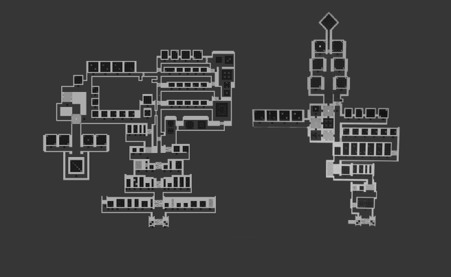
Then the second phase is to aggressively cut puzzles and rebuild the area more-or-less from scratch. So that’s what I did this past week for the dice face area. It shrunk significantly, from 89 puzzles down to 45 puzzles. Slightly more than half the puzzles. You can see the difference between the two versions in the following picture: (newer is on the right)
 Although the new area is much smaller, the progression is way more aggressive, and so it should take as much time (if not more) for the average player to get through. And the average individual puzzle quality in the area should be much higher as well.
So, I would say that overall there have been a myriad of improvements made to the area on this second revision (for one thing, it’s way easier to navigate, while still maintaining a bit of freedom at a certain point), and there are some puzzles which I added which I am super happy with. I’m not 100% done with the area, and some of the puzzles could get moved around or cut even. But, it’s a definite improvement.
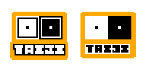
Also, I threw together some ideas of a logo. Probably not nearly as good as whatever Martin could do. One on the left is my own custom font, the right is a font by Eeve Somepx called Moji. I almost never really care about logos, but maybe worth thinking about.

