83. In The Final Stretch

I recently finished one of the two biggest remaining tasks on the to-do list and I’ve been celebrating a bit by working on some less important polish related things. Sometimes I find it difficult to immediately jump from one big challenging task into the next, and it can be good to take a break while still being productive on other things.

Early on, I figured out much of the art direction for Taiji, and most of those decisions I have stuck with until the end. But there were a few things that I changed as I went through the project. A big one of those was how to handle interior lighting.

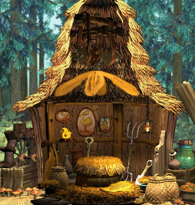
I always knew that I wanted to have seamless transitions from the outside world into the inside world. Most top-down 2D games have separate maps that you load into when you go inside, and I wanted to avoid that. You can see an example of a typical building exterior and interior below (notice that the building is bigger on the inside!)

Although this example is nearly 30 years old, this is still the approach used in most top-down 2D games today. At the time of Link to the Past’s release, I imagine the choice mostly came from system limitations, but there are still a few good reasons to choose this approach today. One of those is that it’s just much more time consuming to keep everything seamless.

So if we don’t go into a separate screen, what happens when you go into an interior? We can’t just keep the roof of the building visible or we won’t be able to see what we’re doing once we’re inside. So instead I decided that parts of the building would be cut away to reveal the interior. Sort of like a diorama of the interior with a removable set of walls and ceilings. A big inspiration for this approach for me was the interiors of Final Fantasy 9, although the Sims games also use a similar approach and I’m sure someone will be able to name a more recent example.

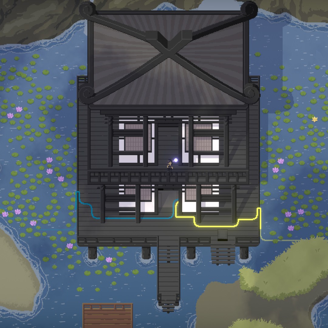
You can see how this approach has turned out in Taiji below:

Although I nailed down the transitions relatively early, it took some time before I settled on a lighting approach. Initially I chose to do the interiors using the same method I use for exterior shadows. This had some downsides of course, in that things were either fully in shadow or fully lit, and trying to do smooth falloffs required dithering. There’s nothing fundamentally wrong with this approach, but it does have some drawbacks that will become more apparent.

When it came time to do some interiors without windows, such as caves, I felt that having the entire area be in shadow looked too flat. So I chose to have the cutaway also allow sunlight into the interior. Unfortunately this created an inconsistency between different interiors, but it at least allowed for some better definition and readability in these areas.

This was the approach I went with until it came time to do the Gallery area, where the interior was expansive enough that even this approach began to look strange. So I thought of a third approach that would allow me to have all of the features that I wanted.

I have briefly covered this approach before in this video devlog, but I will attempt to summarize here as I know not everyone wants to dig through a video.

So, the basic approach is that I have 3 separate “light maps” for the interior. One for the direct lighting coming from the sun, one for some rear bounce lighting, so that windows facing away from the camera can have some light come in, and a third that is for ambient or interior light sources, such as light fixtures or torches.

Each of these three maps is then assigned to the Red, Green, and Blue channels of a single image, with the alpha channel being used to mask off the effect completely. So the final lighting map would look like the following, alongside how it gets composited with the rest of the art in-game:

This is a very effective approach, and although it could perhaps be extended further to allow for darker shadows and brighter highlights, it is what I have settled on for the final game and I’m happy enough with it. The only problem is all those pesky old interiors which I did before I developed this approach.

They’ve been sitting around for a year or more at this point, but this week I’ve been going back through and updating them finally. It’s a more subtle difference in some cases, but I am glad to have things be more consistent. You can look at some comparisons below:

Notice in this case I needed to add some interior light sources, as well as change some other details of the art. Also the approach for “inside of rock” has changed since the old art was done and I updated the art to match that as well.

In this scenario, the difference is much more subtle, although you can notice that the dithering in the earlier lighting makes some of the symbols on the puzzle difficult to read. I also seem to have accidentally flipped some symbols since the earlier builds, so I guess that gives me something to fix real quick.

So, I have been mentioning that the game is close to complete and to expect a release date announcement soon, and I’ve been saying this for a few months now. However, the game has suffered a bit of an internal delay, and “soon” has turned into “not as soon”. With that said, I will once again reiterate that the game is close to complete and to expect a release date announcement soon!

82. Happy New Year!

Well, I didn’t get a trailer done before the new year, but things are still chugging along. I did want to remind everyone once again that I have a more-frequently-updated video devlog over on YouTube, if you’re not subscribed. Maybe I should have always been cross-posting those here, but I always found it a bit nice to keep the two devlogs separate, especially since some people prefer to just read or skim rather than sit down and watch a video. Here’s the latest episode of that if you do want to watch:

I’ve been continuing testing and polishing the game. There are still a couple major things that need to be done, but there are also dozens of minor problems that I’ve been clearing up.

One of those minor problems is readability issues in the environment. Sometimes it’s hard to tell where you can or cannot walk. For example, below is a before/after comparison of the cliff overlooking the Mine area. The player is standing at the edge of a several hundred foot drop-off, but due to a lack of contrast, it was often misread by players as being level with everything else. The added darkness creates a good contrast and foreground/background separation, and it also fades away when you enter into the area, keeping things readable from a gameplay perspective.

One of my art weaknesses is that I often don’t use enough contrast. Perhaps one excuse for my fear of contrast in doing the art for Taiji is that I wanted to avoid distracting noise. But this desire to avoid noise has unfortunately led much of the artwork to look very flat. I still think the art for the game is “good enough.” There’s no way I can go through and try to fix every single thing in the game at this point, but I’m trying to fix the worst spots. And moving forward it’s something that I’ll try to improve upon in future projects.

Hopefully I’ll have that release date announcement trailer to show you sooner rather than later, but I don’t want to put it out until I feel solid about a release date.

Thanks for reading!

79. Assemblage

Since the prior post, the pixel art for the Mill area has been fully completed and I’ve been chopping everything into assets that can be assembled in game. Below, you can see the finished pixel art as well as the current state of integrating it into the game:

You may notice the colors are a bit different in the in-game version (particularly red). This is because the game uses a color grading setup that is not optimized to any particular area in the game. Ideally before release I’ll go through and tweak the color grading a bit for each subarea to lock in a more unique look. If I can’t afford to do that though, I don’t think it looks too bad as it is.

Either way, there is clearly an empty space on the right hand side of the area that needs to be filled in!

The reason the finished art has that empty space is because I will be assembling that section using existing assets from the Shrine area, as it is a mechanical mix-in with the puzzles from that area, and the art for that area was created very modularly.

So, baseline art implementation is around 80% done or so. I still have to implement the exteriors, add some moving parts and add the entrance path below the plateau area to the left. After that I’ll have to add in all the collision and triggers, which is another whole bucket-load of work, but at least everything seems to be proceeding straightforwardly.

I will be very happy to be finished with this area and be focused on tying up the last little loose ends so this game will be ready for release. That’s not to say that I have a firm idea of when the game will be done. Although I think it could still possibly ship before the end of the year, it’s likely to slip somewhat into next year. Thanks for your patience on that front, I’m trying to get things done as quickly as I can.

I know some folks are probably following the written devlog and not the video devlogs, and I’ve been a bit more diligent about putting out those than I have been over here. I apologize for that. I often am remiss to simply post the same information over here that’s in the videos, as it feels redundant, but I think having some updates is better than going a whole month (or two!) without any sign of life.

If you’re not following the video devlog, you can find it on YouTube over here.

77. One in a Mill-ion

Gosh, time sure does fly when you’re making a game. I seem to have let June slip by without an update here. Although I have kept up with the video devlog series over on the YouTubes, I recognize that some folks just like to read a little more than they like to look at my beautiful face and unkempt mane.

I’ve been fixing up small things around the game that have been annoying me for a long time. There’s still bunches left undone on the “nice to have” list, but I’ve tidied up some important ones. Mostly I’ve been doing this because the progression on the artwork for the Mill area has been going a bit slower than anticipated (even though every time I do an area I anticipate it will take more time than the last!)

Part of the delay has been from doing some design revisions to the overall flow of the area. I mentioned these plans in the previous post, but I wasn’t expecting that the structural changes to the area would require so many puzzle design changes as well. It turns out that when you are planning on having an area be mostly knowledge-gated, you have to design puzzles that are specific to this purpose. Good knowledge-gates put up an initial barrier of complexity, but then fall rather quickly if the player has the pre-requisite knowledge.

Who’d have thunk that a good knowledge gate is one that gates mostly on knowledge!

In addition to this, I felt like there were a few small ideas in the area that could use a bit more polish in how they are delivered to the player. One of my favorite things in puzzle games is when I’m put in what seems like an impossible situation, based upon everything I’ve come to assume about the mechanics of the game. But the design or layout of the puzzle allows me to deduce that some move that was previously unknown to me must be possible. So, I have been doing some redesigns to create that type of experience. Requiring the player to guess that there is some emergent behavior of the mechanics that is non-obvious rather than giving them a simple situation which just illustrates it.

At this point, I’m fairly happy with the puzzle set for this area, and I think that the flow of ideas will work well. So I’ve spent the past week or so sketching out some rough ideas for the visuals. This has required me to do a lot of research on different types of machinery so that I can hopefully create something a bit plausible as a functional space.

Concepting is still a work in progress and things are subject to large changes, but here are some things that I’ve drawn along the way so far.

76. Endings and New Beginnings

Things are finally progressing! I finished up the endgame area a week ago and shipped that out to a small group of testers. I believe there will still be some changes/improvements there, but overall I’m happy with the initial feedback I’ve seen.

Experience has shown me that when I take this long between builds of the game, major things will end up broken. Because of that, I’ve been taking a little downtime between shipping this build and implementing the next major area for the game. I didn’t want testers finding game-breaking bugs while I’m ripping up so much that I can’t ship a build until I finish the art for the next area.

Thus far, The bugs have definitely started to flow in. In fact, I’ve not been able to address the endgame area feedback as much as I’d like because there were so many other bugs. But it’s good to have my decision to postpone major changes validated.

In the meantime, as part of my break from game-breaking work, I’ve completed one of those “nice-to-have” improvements on the list; something I thought I might not be able to get done before ship: I’ve been re-doing some of the art for the starting area. You can see a couple comparisons below:

It’s hard to believe it’s already been two years since I originally did some of this artwork, but it’s been in desperate need of improvement for a while. I think the revision has much stronger details while also having a cleaner look that fits better with the rest of the game’s aesthetics.

It’s also a bit of a testament to how much I’ve improved as an artist over the course of this project. When I first started doing the art, I really didn’t know if I’d be up to the task. I’ve done some dabbling in visual art through my life, but I’ve never considered it something that I was particularly strong at. But through a combination of thoughtful art direction choices and just churning away for years on end, I think I’ve achieved something that looks nice and works well for the game.

So, What’s Next?

As I mentioned in the previous post, the next major task on the list is the artwork for the Mill area. I also need to re-think the structure of the area significantly. The current implementation is too straightforward and boring:

As you can see, most of the area is just a straight line. Although there is a bit of branching in the middle, the puzzles on the left side there are completely optional, so the main thrust of the area is totally linear. This structure, combined with the sheer number of puzzles in this area (44 essential, 25 optional), can be pretty exhausting for players to go through, and although adding artwork to the area can help significantly with the fatiguing aspect of the experience, I also want to try some other things.

I’ve experimented a bit with the structural designs for each area as I go along. I always try to do something a little different. Some areas are very linear, with a straight line of puzzles you have to all do in order. Some are mostly linear but with a few splits that you can do out of order. Some are almost entirely non-linear, with many options that are equally challenging.

One of the things I’ve thought about doing with the Mill area is designing it a bit “backwards”, with the player finding the hardest puzzles in the area before the introductory panels. This could backfire horribly, since some players may assume they should be able to solve anything that’s accessible to them, but it fits into my plan to go for a much more non-linear and knowledge-gated approach to this area than I have achieved with any of the others.

By “knowledge-gating”, I’m referring to the concept that the only barrier to progress is that you don’t understand how to do something, rather than requiring the player to obtain some item, or solve a long set of puzzles elsewhere.

Perhaps the area will be split into several buildings which can each be entered by solving a difficult puzzle. Each of these difficult puzzles will require some knowledge gained elsewhere in the area. This means that the player will have to explore around a bit when they first enter the area before they find a puzzle they can gain some traction on, but hopefully it will create that fun experience where the player realizes, after learning some new concept: “Aha! I know how to do that other puzzle now!”

I always try to push myself to do better with every new thing I add to the game. It’s what keeps this project engaging and enjoyable for me over such a long development cycle. (coming up on 6 years now!) Unfortunately this does mean that each new area has tended to take longer than the previous one, but I’m excited to get started on the Mill, and I think it has potential to be one of the better areas in the game.

71. Trees in the Wind

I’ve wanted to get animation for the trees into the game for a while, but could never quite manage it. I’ve tried many different approaches to this, but always the main issue is that the game renders at a fixed low-resolution pixel grid.

Some other pixel art games choose to render the game at a higher internal resolution than that of the actual pixel art, which means that you can rotate sprites without much aliasing. You can see a comparison between a high-res rotation-based animation (left) and how the effect breaks down when you render at a low resolution (right):

I have never liked the look of pixel art games that mix different resolutions, so I chose to render Taiji in a way that would force all effects in the game to be rendered at the same resolution of the base pixel art. But as you can see above, this means that rotating pixel art tends to cause strange artifacts that sort of look like edges sliding across the image. Obviously, this is very unaesthetic looking, and we need to try something else.

One possibility that I tried was to add in some noise to attempt to jitter out the sampling and create a smoother look. This removes the “sliding edges” appearance, but ends up adding in a lot of noise along edges. The effect could perhaps work well with a game that has a more forgiving art-style with a lot of noise built into the graphics.

So, with a couple of failures under my belt, I decided to rule out large motions such as rotating the entire tree, and instead I focused my efforts on animating the leaves on their own. This type of effect can be done fairly easily in a shader by simply adding in a noise offset when you sample the texture for the leaves.

This is certainly an improvement, but the effect is a bit too strong. Also if you look at it closely, it feels more like the tree is underwater than being effected in the wind. We could tone the strength of the distortion down, but then the motion becomes so subtle that it’s almost not worth having.

Another possibility that I attempted was to custom author a secondary texture which would control how the distortion was applied. I tried using a noise texture with leaf pattern built into it. I even did some tests pre-rendering leaves with Blender so that I could use the scene normals of the leaves to modulate the distortion.

I didn’t save this iteration of the shader, but suffice to say that it did not work much better than the purely random noise I was using earlier.

However, I started to think that an approach similar to how I animated the grass would be effective. The grass is essentially just a flat texture on the inside, with all the distortion happening along the outside edges.

So what would it look like if I did the same for the trees?

We’re getting close! This effect is even more pleasing, with a better balance between the details of the original pixel art and significant enough motion to be worthwhile. However, the motion feels a bit unnatural because it is confined completely to the outside edges.

What I chose to do to resolve this was to re-incorporate the idea of having a secondary texture control where the distortion effect can be applied. When used to highlight the internal edges, this forms the final effect. The wind map texture is below on the left. You can see that some interior pixels are colored red, those are the ones that are allowed to be distorted in the final effect on the right:

Overall, I’m pretty happy with how this came out. It adds some much needed motion to the trees, giving those scenes a more dynamic feel, and it doesn’t distort the base pixel art so much that it feels unnatural.

For a fun bonus, remember when I said that the unconstrained effect looked like water? I ended up using the same effect for this reflection in the water:

66. Burnout and Walking Animations

I plan on posting these video development logs on a weekly basis over at my YouTube channel. I may post some occasional reminders here going forward, but I’d rather keep this written devlog as it’s own separate thing rather than simply as a cross-posting of the videos. So, if you don’t want to miss any of the video dev logs, I recommend you subscribe to my YouTube channel.

However, since you’re here instead of at YouTube, I’ll reward you with a few sneak peeks into what I left out of the video log.

This past week, I’ve been working on relatively small polish features, which is a bit of a continuation of the work I did last week with footstep sounds (still have some more of those to do actually). I think this is partly as a way to give myself a break from tearing up major chunks of the game to add artwork. But even if it feels like less progress, these small things propagate across the entire game and affect your interactions throughout.

One of these small improvements is to the walking animations. The previous animations were serviceable, however when I added running animations, the running animations looked significantly better in comparison. So I added more frames to the walking animation and made some small tweaks. You can see the comparison between the old (left) and new (right) animations below:

I still want to add animations for when you move diagonally, and hope to get to that next. But I think even this goes some ways towards giving the game a more polished feeling.

I did a few other fun things, but I’ll save those for next week’s video. Hope to see you then. 🙂

62. Metamusings

Four of the ten major sub-areas of the game involve symbols embedded into the puzzle panels which the player figures out the meaning of over the course of the area. In each of those areas, there is also metapuzzle used for navigating that area. These metapuzzles require the player to solve multiple puzzle panels which interact with eachother in some way. Each area has a unique theme to this metapuzzle which is connected to the general theme of the area’s mechanic in some way or another.

I’ve had three these metapuzzles designed for a while now, but I’ve been spending the past week or so designing and implementing the fourth one. I’m also in the middle of ripping up the area containing it and doing a proper art pass on it, so the following screenshot is an example of something super work-in-progress:

I don’t want to explain too much of how the puzzle works, so as not to spoil things, and because I am likely to change some details as I continue implementing it. But the basic idea is that you can move the bridges between each circular platform and you use that to get around the area.

It’s been a bit of a technical challenge to get this puzzle implemented, and as of this writing, there are still a few features that are not set up yet. Part of the challenge here is that so much state can be changed across the metapuzzle, and it’s important to keep all of the state in sync.

The overall theme for the area is a terraced garden surrounding a dry lakebed. The major features of the area are still work in progress as well, but I have begun some work on the artwork for the entry terraces, which you can see below:

These will require some more detailing work, but the overall structure is more or less correct. The design of the stepped gardens is loosely based off the Hyakudanen at Awaji Yumebutai. In the game, the player will start at the stop of this stairwell as the entryway into the area. Once they get to the bottom, they will find some puzzle panels opening access into the metapuzzle section.

59. Shrines and Ancient Ruins

It’s hard to be sure exactly what to write about, since most of the work lately has been going into painting over each of the areas in the game. But this past month I’ve finished drafts of art for two major areas in the game, so I guess I’ll post up some screenshots!

(You can click any of the screenshots to view them full-size)

Shrine

This area is styled after a Japanese shrine and centered within a large lake.

Ruins

This area is an ancient ruin seated atop a narrow plateau. Some parts of the ruins have seen better days.

You may recognize this area from an earlier iteration of the art. Some parts of this area are still unfinished, art wise, and I need to add in the shadows. (I paint in all the shadows by hand!)

Bonus

Here’s a bonus screenshot of another area in the game.

58. Arts and Crafts

This past month, I’ve been both working on Taiji and crunching on promotional materials for Manifold Garden. (Which is out now on Apple Arcade and the Epic Games Store, by the way! You should check it out if you like puzzle games. I get no extra money if the game does well, so I am just recommending it personally.)

Seeing off Manifold Garden has been exciting. But turning back around to work on my own thing has been a bit depressing. It still has so much further to go before it will be done! I’ve been trying to keep my head on straight but it’s been a bit of a damper on my spirits.

The Breaking Point

Some technical aspects about the visuals in Taiji started to come unraveled earlier this month. One of the decisions I made early on was how to sort all of the individual graphical elements in the game. Although for 3D games, sorting is just handled as part of the perspective (except for translucent objects), in 2D games you usually set up an explicit sorting order.

In Unity, there are actually two systems you can use to handle sorting, the first is a sorting axis, which is equivalent to the Painter’s Algorithm: objects that are further away from the camera are drawn first and closer ones are drawn last.

The other system is Sorting Layers. These are just buckets you can put different objects into and you can set the order in which the buckets draw. My initial idea was to only use 3 sorting layers for the entire game: a layer below the player, the player layer, and a layer above the player. This seemed like it would work, because you are additionally allowed to specify a numerical sorting order for the objects within each layer.

The primary benefit of this approach is that it is player-centric. This means that I know that all objects in the “Below Player” layer will always be drawn below the player, and vice-versa for the “Above Player” layer.

But what happens if I want to have objects that are above the player at one point, and then below the player at another?

There are two types of scenarios where this problem might happen.

One is “vertical” objects that the player can walk around, such as trees. If we place them below the player, the player will be walking above the branches, and if we place them above, then the trunk will float over the players head. This problem is easy to solve by simply placing those objects on the player layer. In this case, Unity will fall back to the sorting axis and sort by distance. However, we can tell Unity to sort using the Y-axis, instead of the Z-axis. This means that objects that are higher on the screen than the player will draw behind them, and those that are lower, draw in front.

The other slippery sorting situation is when the player is underneath an area which they can climb up into. A basic example of this is a bridge over a canyon. The player might be in the canyon, walking underneath the bridge, but they can also climb out of the canyon and end up above the bridge, walking across it.

The player can go up those stairs at the top of the screen and then walk over the bridge.

This scenario is challenging to achieve under a simple 3 layer (Below Player, Player, Above Player) setup. The only real way to do this is to either shuffle all the objects between the above and below layers, or have copies of the objects on both layers, and only enable whichever is appropriate depending on where the player is.

I was using a mixture of both of these systems up until recently. It worked, although it was quite cumbersome. You’re moving around of dozens of objects from layer to layer all the time, and you can’t even see any of the visual issues until you run around the game. But eventually you run into scenarios where there need to be more than two layers, and it all falls apart.

So I made the difficult decision to change the entire sorting system used by the game. Under the new setup, each area in the game has a sorting layer, and the player is moved from layer to layer as they walk around the world, always staying at order 0 in whichever layer they are in. Objects with negative sort values will be below the player in that sorting layer, and those with positive values will sort above the player.

This setup makes so much more sense. Since only the player ever moves around, I never have to worry about the environment looking any different than it does in the editor.

In fact, I feel like I should have changed things over much sooner than I did.

I think this particular type of mistake was misguided optimization, which is even worse than premature optimization. Instead of optimizing for my sanity, and the simplicity of building the game over the long haul, I tried to optimize for the number of layers without being sure that it would ever be an issue. It wasn’t a performance concern, more just an aesthetic one.

I think it’s important to accept that your game is going to be a big icky mess at some point anyway, so you just should just leave the cleanup until you can actually see what you’re dealing with.

In any case, things haven’t been perfectly rosy with the new setup, but I’ll leave that story for next month perhaps. See you soon.

Proof Of Work

Perhaps you’d like to see the work I did related to Manifold Garden? If so, you can check out the following links:

Mood Trailer

Manifold Garden Instagram (Daily Videos since July 18)

Edge Detection & Anti-Aliasing Comparison 2015 vs 2019

Architectural Inspirations

Now Available Trailer (Although about 80% of this was Derek Lieu, and I just polished it up and replaced a few shots)

I also did a ton of odds and ends stuff that I can’t really take the time to list here, but suffice to say it’s been a bit busy.