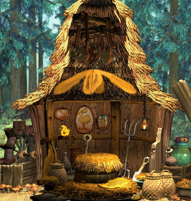
I recently finished one of the two biggest remaining tasks on the to-do list and I’ve been celebrating a bit by working on some less important polish related things. Sometimes I find it difficult to immediately jump from one big challenging task into the next, and it can be good to take a break while still being productive on other things.
Early on, I figured out much of the art direction for Taiji, and most of those decisions I have stuck with until the end. But there were a few things that I changed as I went through the project. A big one of those was how to handle interior lighting.
I always knew that I wanted to have seamless transitions from the outside world into the inside world. Most top-down 2D games have separate maps that you load into when you go inside, and I wanted to avoid that. You can see an example of a typical building exterior and interior below (notice that the building is bigger on the inside!)

Although this example is nearly 30 years old, this is still the approach used in most top-down 2D games today. At the time of Link to the Past’s release, I imagine the choice mostly came from system limitations, but there are still a few good reasons to choose this approach today. One of those is that it’s just much more time consuming to keep everything seamless.
So if we don’t go into a separate screen, what happens when you go into an interior? We can’t just keep the roof of the building visible or we won’t be able to see what we’re doing once we’re inside. So instead I decided that parts of the building would be cut away to reveal the interior. Sort of like a diorama of the interior with a removable set of walls and ceilings. A big inspiration for this approach for me was the interiors of Final Fantasy 9, although the Sims games also use a similar approach and I’m sure someone will be able to name a more recent example.


You can see how this approach has turned out in Taiji below:
Although I nailed down the transitions relatively early, it took some time before I settled on a lighting approach. Initially I chose to do the interiors using the same method I use for exterior shadows. This had some downsides of course, in that things were either fully in shadow or fully lit, and trying to do smooth falloffs required dithering. There’s nothing fundamentally wrong with this approach, but it does have some drawbacks that will become more apparent.

When it came time to do some interiors without windows, such as caves, I felt that having the entire area be in shadow looked too flat. So I chose to have the cutaway also allow sunlight into the interior. Unfortunately this created an inconsistency between different interiors, but it at least allowed for some better definition and readability in these areas.

This was the approach I went with until it came time to do the Gallery area, where the interior was expansive enough that even this approach began to look strange. So I thought of a third approach that would allow me to have all of the features that I wanted.
I have briefly covered this approach before in this video devlog, but I will attempt to summarize here as I know not everyone wants to dig through a video.
So, the basic approach is that I have 3 separate “light maps” for the interior. One for the direct lighting coming from the sun, one for some rear bounce lighting, so that windows facing away from the camera can have some light come in, and a third that is for ambient or interior light sources, such as light fixtures or torches.

Each of these three maps is then assigned to the Red, Green, and Blue channels of a single image, with the alpha channel being used to mask off the effect completely. So the final lighting map would look like the following, alongside how it gets composited with the rest of the art in-game:

This is a very effective approach, and although it could perhaps be extended further to allow for darker shadows and brighter highlights, it is what I have settled on for the final game and I’m happy enough with it. The only problem is all those pesky old interiors which I did before I developed this approach.
They’ve been sitting around for a year or more at this point, but this week I’ve been going back through and updating them finally. It’s a more subtle difference in some cases, but I am glad to have things be more consistent. You can look at some comparisons below:


So, I have been mentioning that the game is close to complete and to expect a release date announcement soon, and I’ve been saying this for a few months now. However, the game has suffered a bit of an internal delay, and “soon” has turned into “not as soon”. With that said, I will once again reiterate that the game is close to complete and to expect a release date announcement soon!
