29. Animation Nation

The past two weekends, I have been working on revising the design and animations of the main character. The old sprite has served prototyping fine, but it’s time to start working on actual art for some parts of the game, both so that I can start designing puzzles that use more subtle visual cues, as well as for the purposes of being able to promote the game at all. (Prototype grey-box environments can be fun to play around in, but don’t show very well)

Part of this process involved deciding on an approach for implementing the animations into the game. Unity already has a very robust and complex animation system built in to it, but it is much too complex for what I need for a simple 2D pixel art game. Unity’s animation system is built for handling complex motion blending and IK with 3D models. Also, it doesn’t really allow for easy control of animation switching from code. You have to establish all your animation parameters and transitions in the Animation FSM through the Animator panel.

So, I set about coming up with a quick and dirty replacement which would basically allow me to, in code, just say “play this animation now”. This took way longer than it should have, primarily because I couldn’t get a custom inspector for my new “Sprite Animation” component to display the information that I wanted correctly. Eventually I threw in the towel and just divided the system into two component types. One “Sprite Animation Strip” component is added for each individual animation, and there is a master “Sprite Animation” component which handles playing the animations and switching between strips.

animationsystem

It’s pretty messy, primarily because there’s no clear indication of which animation strip is which when you’re looking at the array under the Sprite Animation component. Because of this confusion, it’s not a particularly tenable system if you have dozens of animations, but for the time being it has served my purposes fine.

Here’s a gif of the current work-in-progress walking animation in action (the environment is still just grey boxes though:

firstpasswalkinganim.gif

There’s a lot of room for improvement. Most notably, I need to fix the hair so that it is always blowing in the same direction. To do this, I’ll probably make the hair a separate sprite which gets overlaid over the main one.  Also she shouldn’t suddenly get a haircut when she is walking, but it is a good start.

Oh, and here’s a bonus gif of just the standing animations on top of a more detailed background.

NewPlayer_Standing

28. Concept Art!

I wasn’t exactly feeling like my brain was functioning within established parameters yesterday, so I decided to work on some concept art.

taiji_binaryarea_concept

I’m pretty happy with how it turned out. Part of the concern with doing an art pass on the game is that I wouldn’t be able to make the art look good and still be relatively low on noise. Since there are a lot of puzzles in the game that are about noticing small details in the environment, it’s important to avoid having distracting elements. I think this concept strikes a good balance between those two goals.

It’s still somewhat plain, and I do need to do a lot more work to be creative with the environment design, but overall, it doesn’t look too bad.

In addition to the concept art, I did spend a bit more time on some puzzles for the dice face area, and I think I’m relatively happy with that area for now. I also got a weird idea for a shifting maze puzzle that hasn’t quite fully formed into something good yet, and perhaps will not do so.


27. More Gallery, and More

This weekend, I went through my backlog of ideas of puzzles for the gallery area (an area that I mentioned briefly in the previous blog entry.) There are now actually 31 puzzles in that area, quite a decent number of puzzles, in spite of the fact that it sort of started as an “odds and ends” area. I still feel a bit uncomfortable about the concept behind the area, because it feels so explicit: here’s an image, solve some puzzles based on it. There are a few puzzles in the area that are a bit more subtle than that, and I have some hopes that when I get around to doing an art treatment on the game, I’ll be able to bring in a bit more of that subtlety. But, as is, I do like some of the puzzles in the area a lot, and testers have tended to enjoy them as well.

I spent a bit too much time on the stream drawing a perhaps poorly hung painting of a snowman for this area, so I’ll share the final image here on the devlog:

painting27

Other than gallery puzzles, I spent a bit of time trying to come up with some good intermediate puzzles for the dice-face area, as well as moving towards tidying up the end flow of that area. I didn’t make a ton of progress there, but I did start to make some interesting realizations about the mechanics there that I had not quite settled on before. I am hoping to come up with some good ideas there to take the end of the area to another level, but they haven’t quite hit me yet.

Overall, slow and steady with only being able to work a day a week, but progress is at least happening.

26. Regular Streams

I’ve been streaming on a regular schedule lately, so if you haven’t had a chance to come out to one of the development streams. They are usually at 3PM EDT on Sundays. This last stream started a bit later, but generally that’s when they are. Here’s a link to the twitch page.

I haven’t posted a devlog entry in a couple weeks, but I have been getting some good work time in on the game, thanks to the regular streaming schedule. Just been hard to find time between working on the game and my day job to actually write a update.

So, I’m pretty excited about some of the stuff that I’ve been working on lately, but I feel like I don’t want to spoil it. Most of what I’ve been doing laterly is puzzles that are a bit later in their respective areas. If you don’t care about being spoiled, you can definitely see exactly what I’ve been working on in the development stream archive, but I’m gonna try to keep the blog a bit safer as far as spoilers go, so I’ll just talk a bit in general about what’s up.

For the past two weeks I’ve been focused on the “dot puzzles” area, which I’ve talked about in a few previous blog posts. Specifically I’ve been working on improving the second half of the progression. The existing puzzles are enjoyable, but after a while, they can begin to feel monotonous. So I came up with some additional layers for the mechanics there. I also started mixing the dot mechanic with some other mechanics from elsewhere in the game. I am hopeful that the mixing will be at least a little bit surprising.

I know that’s a bit of a vague description of what I have been doing, but I’ll just post an interesting looking puzzle and let you speculate.

eenteresting

Additionally, after those two weeks of focusing on the dot puzzles, I was starting to get a bit bored, so I decided to shift my focus onto another area of the game. This is an area which I have not really talked much about on the blog here. I call it “the gallery” area. I like the area a lot but I want to avoid spoiling it as much as I can.

Again, most of the work that I am doing here is late in the area. However, I do think that many of the puzzles in this area are abstract and esoteric enough that it is safe to show you a teaser of something strange.

painting19

See you next week! I hope you come out to the stream. 🙂

25. Testing

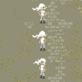
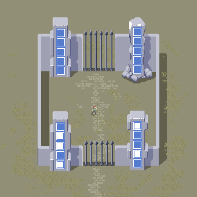
So, as I mentioned in the previous post, I spent last weekend sending out a build of the game to several testers. Because the game is starting to get a bit large, I decided to cut out a couple of the areas which will be in the full game in order to focus the demo only on things that have changed.

What was left took most testers around 2 hours to play through, although some finished more puzzles than others. I’m uncertain how much additional playtime the removed areas would be, but I believe what was tested is a substantial portion of what’s in the game at the moment, so I wouldn’t expect it to add more than another half hour or so.

That’s obviously not really indicative of the final playtime of the game, as things will probably change and some areas will be expanded or reduced in certain ways. I’m a bit ambivalent about the length of the game, as the game is both intended to be “as long as possible” and “wasting as little time as possible.” I’m not entirely certain that it’s not entirely wasted time free, as there is still a lot of traversal time, especially for players who want to leave areas and return to them later. That’s certainly a problem that I hope to solve before shipping a final version of the game, probably by allowing players to warp in/out of each area.

Across all 5 testers, all puzzles were solved at least twice, so that’s some good evidence that the game is at least not totally off in cat hair moustache land. I’d like for people to have a hard time with at least some puzzles in the game, but at the moment there were really only two puzzles which totally stumped people. Not to say that the puzzles were easy, some players would easily spend 10 minutes on some panels. But I would like there to be quite a few more puzzles in the final game that cause people to pack their bags and go home without solving them, as long as they’re good puzzles.

For the most part, most of the things in the game are working the way they should be working. There weren’t many catastrophic failures, but I did have an issue crop up that I’m not entirely certain how to deal with.

Dice Conundrums

(The following could be considered to contain minor mechanics spoilers for puzzles in the game. I don’t describe how the mechanic works in detail or show any puzzle solutions, however.)

One of the issues which came up in this round of testing is one which I had already considered for some time, but have been unable to really come up with a proper solution to. And that’s for the puzzles in the “dice face” area.

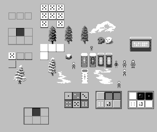
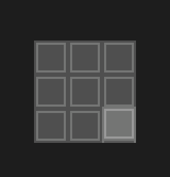
For reference, the puzzles look like this, where they have tiles which are marked by black or white dots. The color of the dot indicates whether the tile should be on or off. As a player, which of the two answers on the right would you presume to be a correct way to interpret the symbols? Stop for a moment and think…

dicefacepuzzles

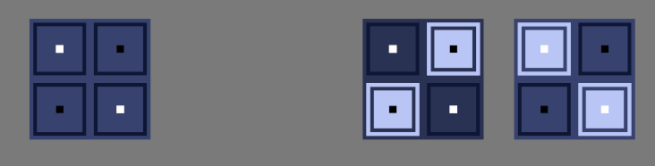
If you chose the one on the left, congratulations! You’re correct.

The issue, however, is that many players see the solution on the right as more intuitive. This is not particularly out of the question, as white meaning “turn it on” is quite a natural assumption, and I make use of that assumption elsewhere in the game. It makes sense, but there is an issue. Really, two issues.

Firstly, that when the player solves a puzzle, I light up the panel tiles which were highlighted very bright. In this case, white:

solveddicepanels

The issue should be immediately apparent here. If the correct answer is white on white, that means there is no contrast and we cannot even see the white dots anymore. It is difficult to see the black dots as well, but this could be remedied by choosing a brighter panel background color.

Alright, but I could still solve this issue in one obvious way, which is to make the solved panel color be something other than white, or make the white dot colors be not as bright, both of which are shown below.

solveddicepanelsnotwhite

This is fine a fine solution, apart from my other reason for choosing contrasting colors, which is simply for the aesthetics.

Where are the Dice?

There are puzzles later in this area which have more dots per each tile. The patterns of the dots are the same as those which are found on the faces of dice or dominoes.

domino

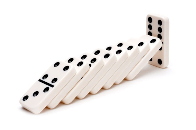
Notice something about how dice and dominoes are colored? Notably, they are colored for contrast. Black on white or white on black.

There is another aesthetic consideration when it comes to the coloration, which you will find at the top of this blog, but I’m reproducing below in case I change the blog design later on:

panel_title_img

If I take as a solution to change the solved color or the dot color, we would get the following:taijipanelvariations

Neither of which really look very good or imply what the original means to. This is a somewhat less important point than the previous one about the dice, but I believe it still stands.

Okay, so you may be thinking about one other possibility which I have not thus far entertained. Why not simply outline the white and black dots?

dicepaneloutliningissues

The issue here is, I think, quite apparent. I just don’t really have the pixels to go around to properly outline them. The five white dots on a white background is just a mess and doesn’t read properly as five dots.

Perhaps if I make the individual tiles bigger?

dicefaceoultinedbigger

This solves the readability issue, but my concern now is that it is not very apparent which of the two possibilities is correct simply based on the visual.

Anyway….

I have perhaps rambled about this one point for long enough, but suffice to say it is not a problem that is entirely simple to solve, and I wanted to be clear about how much I have thought about it. I think I have a bit of an idea on how to mitigate the issue with future players, however. As I think a big part of the confusion is the lack of awareness of why they are even that way in the first place. So, I will try priming players with the idea of dice before they enter the area and this may help them to make that connection.

Even if it doesn’t, I have not had a ton of testers complain about this issue, and I believe I have at least two other minor changes that can be easily made to reduce confusion in the area.

18. Interface Work and Concept Art

This week, I have been pretty happy with my productivity on the game. I actually did a couple of development streams for the first time in like 6 months at least.

So, what exactly have I been up to this week?

Concept Art

One of the items on the tasklist for the game ever since I started thinking about doing the art myself was to try to do a full concept piece, in order to get some kind of idea of what an area in the game might look like in the style I’ve been working in. After all, doodles are nice but they don’t really look like a game.

So, the piece that I decided to do is intended to be a take on the starting are of the game, which is a floating island.

taijistartconcept2x

Obviously this is super WIP, and I wouldn’t necessarily expect the final version of this area to look anything like this, or the final art to resemble this beyond the broad strokes. But overall, I’m pretty happy with the way it came out.

Interface Redesigning

The main subject of my streams where I was working on the game was the issue that stymied me so badly for the past six months, which is the issue of how the player is going to interact with the panels in the game.

Since I didn’t have a particularly great idea of how to proceed, I just went ahead with what seemed like a good idea and implemented a point-and-click interface. This means that the player can walk around, but also use the mouse to click panels and toggle them off and on.

taiji_clickandtoggle

The interaction of just clicking and toggling the tiles feels pretty good, but it unfortunately ends up creating a bit of a separate issue. Explaining exactly what the issue is will take a bit of doing, but I’ll try.

As I explained in one of the early posts on this blog, the toggling type panels are not the only type of puzzle in the game. There are also another kind of puzzle in which the player is constrained to draw a line by illuminating tiles one at a time next to each other. In the game, this manifests as the player walking across the panel.

taiji_clicksnakepuzzles

The issue comes that I’m not sure what sort of symbology to use with these “snake” puzzles, because when the player is clicking on these squares with the mouse in order to toggle some panels, when they see another identical square, they want to click it. I could perhaps solve this issue by having all the tiles on the snake panels be the “broken square” type that you see pictured here. This is nice because they appear to still be tiles, but they don’t feed into the square symbology so much that the player will assume they can click them.

However, this is still not a full solution to the problem, because I am already using that symbol to represent tiles that the player cannot start from when they are walking around on the panel. In fact, I came up with this idea in the first post on this devlog.

So, I’m not really sure what I can do for these panels that won’t really conflict and will not really seem ugly or in-obvious. I did some tests on the stream of a few possibilities, but none of them really made me happy. I have even considered simply raising the starting tile, but that runs into other issues, in that I then have to ask the player to press a button when they step on each raised tile, or else they cannot start at a tile in the middle of a panel if all of the tiles on the panel are startable.

A Solution?

So, the solution that I’m currently entertaining as of the time of writing this post, is to simply abandon the point-and-click interface, and have the player always walking on all of the panels in the game. This is naturally a consistent interface, but is a choice that I had been avoiding, primarily for aesthetic reasons, because it implies the constraint of always having the panels in the game be on the floor.

However, I may be able to accept that constraint. Either way, I’m not sure what the “right” answer is, I am just trying to do something that has the lightest contrivance.

(There is still another issue with this particular approach that has to do with some of the types of puzzles in the game, but I believe that I have a tenable solution for those as well. I can’t really go into the nature of those puzzles though because it would be spoilers. Perhaps you will be able to catch it on one of my streams, though.)


16. More Art Style Testing (COLORS!)

In the last post, I mentioned a bit about getting back to looking at doing color in the game, because believe it or not, I’m not making an entirely black and white game. I very much want to do an art style which is mostly monochrome but has splashes of bright colors that pop against the rest of the image.

Here’s my first test of that:

spritingtest4_2

It’s again not a proper mock-up, but is more of a doodle, but I am very happy with where things are going and will try to perhaps do a proper mock-up/concept in the next week.

I’ve gone back and forth about whether I should talk about spoilery things on this blog or not. In general I feel like it’s okay because I haven’t really planned on making the blog public, but as time goes on, I keep thinking maybe I should make this public anyway. I just worry about talking so openly about big reveals in the game that I would like to keep under wraps. Or especially as may be the case here, big reveals that haven’t fully formed yet and so talking about the “ideas” is somewhat irrelevant.

I think for now I’ll just talk about what I’m thinking anyway and worry about it down the road, and perhaps it will make this blog stay more of a pure thing anyway by doing that, because I’ll have reason to not publish anything for spoilers.

(SO, SPOILERS, also some spoilers for The Witness here)

So, what I keep thinking about and what’s stumped me for like 6 months is the interface issue, as well as my desire to have some sort of equivalent of The Witness’s layer 2. This is mainly because I feel like my game takes obvious inspiration in terms of the panel puzzles from that game, but I don’t have any equivalent of the environmental puzzles, nor did I ever even really conceive of a thing. Since, in the case of The Witness’s design, the environmental type hidden object thing came before the rest of the idea, I am kinda at a disadvantage and maybe working backwards.

It’s certainly possible that I should throw in the towel here and just not have any thing of the sort in my own game, but I feel like that would probably be a disappointment to anyone who came to my game based on its similarity to the Witness and were hoping for a similar type of experience.

However, this is a real tall order, because I can’t simply do the same thing that The Witness did. For example, one could imagine a first-person version of Taiji where nothing in the world is square, with organic architecture with lots of flowing curves, and hidden squares in the environment which the player needs to line up their perspective to see. It would perhaps be a cool thing in a way, but it would nonetheless be entirely derivative, and for me, not that satisfying to design.

Essentially it would be the same game, only with a different symbology. The circle would be traded out for the square:

circlesquare
The circle is the one on the right.

So, I would rather take a cue from The Witness on a higher level than that, and instead think about how I can have a similar level of secret. How I can have a game that builds towards a startling revelation but does not have the same revelation, so that it would be just as satisfying to a player who had already played The Witness and might go in with a certain mindset and expecting a certain thing.

This more or less means that I have to work backwards, but I am hopeful that I will come up with something that is at least interesting and different, even if it doesn’t end up being profound.

So, the real spoilery thing, if I actually succeed is what exactly my thinking is on that secret.

I’ve thought a lot about what it should be, and my current best guess, as well as the only idea that I’ve taken far enough to visually prototype is this idea of selective color.

Over a year ago, when I first started the project in its conceptual phase with Martin Cohen, I was thinking about a Zelda-type game with a color theme, but I was not exactly sure how that would manifest. I kind of had an idea that you might be able to add or remove objects which were a certain color. Now, I am coming back to that idea, but I am planning on taking a somewhat different approach to executing on it, which is mostly in having the primarily black and white world, so that color objects will stand out.

My hope is that if I give the player explicit ability to interact with colored puzzle panels, they will perhaps not put together the link that they can also interact with objects of the same color in order to solve puzzles. We will have to see how that turns out in practice, but essentially the idea is just that color will be used as a marker for something in the environment that can be interacted with and perhaps this can be done in a subtle and revelatory way.

The other thing is thinking about generosity in terms of game design, because I have a primary worry about this “layer 2” nonsense since forever ago. Namely that it will feel too restrictive and therefore won’t be very satisfying. It will feel more like, oh I just need to find the red things and then click on them. So, that’s the main thing that I haven’t really figured out yet, but part of me has wondered if I shouldn’t just opt for a game design where the entire world is toggle-able on and off. I’m just not even sure how a game holds up when you can do that type of thing. I certainly don’t want to go halfway and then put limits on what you can and can’t toggle in a way that feels arbitrary. So instead, I must simply come up with rules about what is interactable that feels good but also feels surprising.

sokoban
An example of an explicitly tile-based game, perhaps you could toggle tiles on and off?

I suppose that’s all a bit rambly, but my main thinking is that the color limitation will make it not feel arbitrary what is interact-able or not. The only concern then becomes whether or not it makes it feel too restrictive or unsurprising. I may need to think about it for a while longer before coming to the proper conclusions about how exactly to implement the idea.

15. Art Style Tests and Layer 2

Over the past week or so, I have been thinking more about how to do a big secret in the game, and I think that I may have come up with something that will work reasonably well without being too obvious.

I’ve also been doing some artwork testing, thinking about what types of styles I’ll be able to achieve on my own, and focusing primarily on values. I am also doing low-color pixel art aesthetic. I don’t love love the results yet, but they aren’t too terrible and perhaps indicate that I can do the art myself:
spritingtest3_2

It’s not exactly a proper mock-up or even a piece of concept art, but more just a collection of doodles using the limitations I’m looking at. I do want to add some color in, but I’ll get back to that later. 🙂

There are really 4 major limitations to the art style:

  1. I have to be able to do it.
  2. It needs to be relatively flat, while still looking good.
  3. The panels need to be clearly readable.
  4. (Sorry, this one’s a secret)

14. Kept You Waiting, Huh?

So, it’s been a good darn while since I posted on the devlog, but it’s also been a good darn while since I did any actual work on the game. Today I decided to sit down and start doodling some pixel art, considering the very real possibility that I will need to scope the game at a level where I can do everything myself. I started the project with Martin Cohen, who is an excellent pixel artist and musician, but realistically speaking I cannot afford to pay anyone to do art or music for the game. It’s just not a feasible proposition, and the game is roughly 50% cheaper to make if I just do everything myself (not entirely, as I am much less productive than Martin…hmm…maybe Martin pays for himself after all, hahaha!)

Anyway, so I’ve been thinking about what types of art that I can actually do, and since I suck so much at color, I figured I’d at least start with some black and white mock-ups:

spritingtest

I may actually stick with black and white and low color counts for the full game, because it’s an interesting limitation, and I think you can still do some good things with it. But, perhaps if I keep at this type of thing, I might be not terrible enough to actually do color stuff too. The bottom right mock-up is a bit more of a game boy palette, but is just what aseprite automatically chose from its default palette.

Scoping

I kinda want to talk about scope a bit more though, as I find that it is perhaps the biggest determining issue for me as to whether or not I can complete a given project. On my last game, I think the major reason that I was unable to ship the game was because I had set the bar for completion too high. I had brought on a very talented artist to do hand-painted art for the game, but looking back on it, I really should have just done pixel art and done it myself.

The fact is that I can do music and art, I am just not as talented as other people. But the fact also is that other people cost money, and although I can and have pursued profit-sharing in the past, the truth is that if the people you are working with are worth their salt (which they should be if you want the game to be successful), then they will find that salt elsewhere.

The problem with downscoping for me has always been that it’s just extremely hard for me to do it. It always feels like I’m compromising on “the vision” for the game. I understand that it really doesn’t matter what I dream for the game if it’s not possible for me to actually achieve that, but I always seem to have a hard time lowering my expectations for the project and just shipping something.

Suffice to say, it’s a concern that I really go back and forth on and I don’t have a strong opinion about, but if I’m accepting of my own limitations, it makes sense to try to lower the bar for completion a bit on these longer term projects and accept that I’m not going to ship the best looking and biggest game ever as my first project.

At least as long as I have like no money in the bank.


8. Optimizing Panels

This week I did some nice polishing work on the panels in order to make them look nicer. I also switched the game from an orthographic camera to oblique rendering. If you have no idea what that is, essentially it means that the game is in 3 dimensions, with the third dimension simply being represented as an offset on the first two. It’s the method that most 2D top-down games use to render their art, although usually it’s not actually computationally represented as 3D objects.

The nice thing about moving to oblique rendering is that you can put 3D objects in the scene and they “just work.” I really only switched because for the snake panels I wanted to do an effect which looked like this, where the individual tiles popped up and down:

snake_puzzle_protoanimbig

There is a problem with doing this in a completely 2D method, because then you need to worry about sorting of the individual tiles. Although this is not a particularly complicated problem, it just seemed easier for me to switch to an oblique rendering mode and make each tile literally pop up on the Z axis.

I may regress on this decision at some point, but really there’s no downside to rendering with this method, as if you keep everything on the same z plane, it’s exactly the same as 2D. The main issue that kept me from going to this method earlier was a weird sorting bug, which I eventually tracked down to the fact that my multi-pass rendering method (which I use to get smooth sub-pixel motion that preserves the sharpness of pixel art) was set up to use a render texture without a depth-buffer.

But as for the actual 3d objects part of it for this particular effect, I may change my mind, as I want to have tiles both on the floor and on walls, and due to the way the projection works, the tiles on the wall would need to be rotated along the Z axis to properly be drawn, which would require changing the way the panels work somewhat. Either way, it shouldn’t be too much work to switch it over.

Here’s a (poorly compressed) clip of the results. I think it’s pretty close to the above mock-up:


Optimization

The only downside to doing this polish work is that I ended up adding a lot of fancy interpolation and additional detail objects to the tiles on the panels, which resulted in some performance issues. The game got down to running around 20fps on my (reasonably good) desktop PC.

So, I decided to take some time to do an optimization pass on the game. Which was pretty fun. I relied quite heavily on Unity’s built-in profiler tools, which can be very helpful sometimes and not really helpful at all other times. In particular, I’m still having a NullReference issue on script reloads which I am not really sure what to do about yet. I’ll have to build a small test scene to really track that one down.

I won’t go too much into the details of the optimization, but I did want to point out a couple of fun things which I learned.

Color == Color is quite slow in Unity because under the hood it is doing a approximate equality test. So I gained a 10x speedup just by switching to a component-wise test on color equality. I know, I know, you’re not supposed to directly compare floating point values, but in this case I believe it was acceptable as I’m only trying to see if I already set a value or if just changed this frame. You might ask why I didn’t just use a has_changed flag and a setter function. And the answer is somewhat complicated, and mostly has to do with having a lot of state that is not being properly tracked in one place at the moment. Which means I probably need to redo a lot of the panel code to consolidate the state tracking and so something a bit more of a FSM per each tile than what I’m doing.

The other interesting thing was, there was a serious overhead just from the number of active GameObjects I had in the world. (Over 10,000) For active GameObjects, at least those with an attached script, Unity has to call the Update() function on each of them, even if it immediately returns. The optimization here was pretty simple, just disabling panels when they are not on the screen.

Another little bit there that was kinda wierd, I was using Unity’s built-in Bounds object to store the boundaries of both the screen and the panels. Unfortunately, again, accessing Bounds.min and Bounds.max was secretly under the hood doing some computations to figure out those values, as they are not actually stored. And since I was checking each panel each frame to see if it had become visible simply by comparing the bounds, and there are over 200 panels in the game, that was contributing a few milliseconds just by itself. A fairly simple fix again, just cache those values and compare the cached versions rather than using the Bounds object directly.

Perhaps the lesson I’ve learned here is to avoid using the built-in Unity types as much as I can, as they all seem to do unexpected and somewhat computationally expensive things under the hood when you are just attempting to access a value or compare equality. Also, the dangers of overrides.

Anyhoo, a bit of a technical week, as I continue implementation of the new interface system, but hopefully it’s been fun to read about some of those details for some of you. 🙂